
Hullaballooza
Brief: Create a fun and colourful festival brand that uses social media and email marketing for its primary advertising.
Project Specifics: Create patterns and graphics that can be used in multiple formats, that give a fun, retro vibe.
Branding
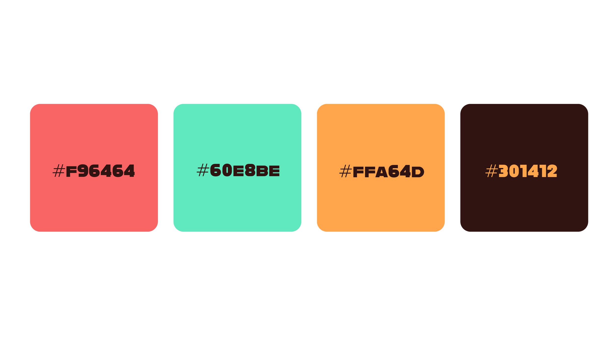
This branding design needed high-contrast colours to maintain web suitability, as well as a neat but thick
font to grab attention. The following choices were settled upon as meeting these needs.
These colours were based on primary colours - red, blue and yellow. Two bright colours with a darker yellow for contrast. The deep brown also provides a visually interesting anchor to contrast against the brighter colours.

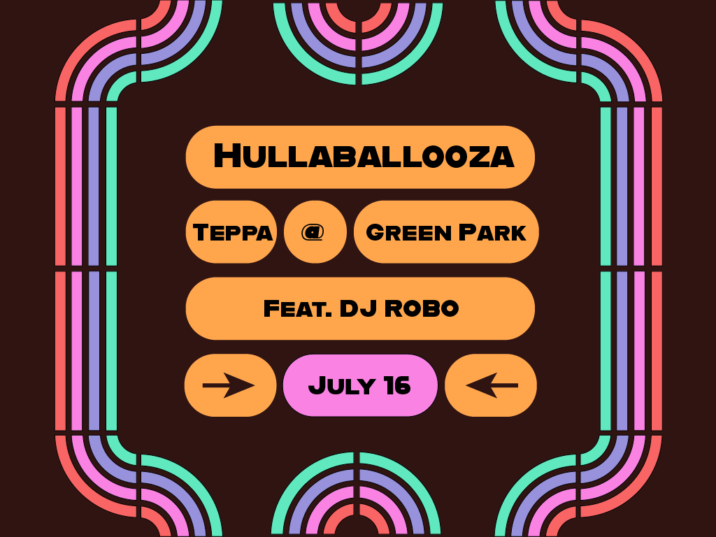
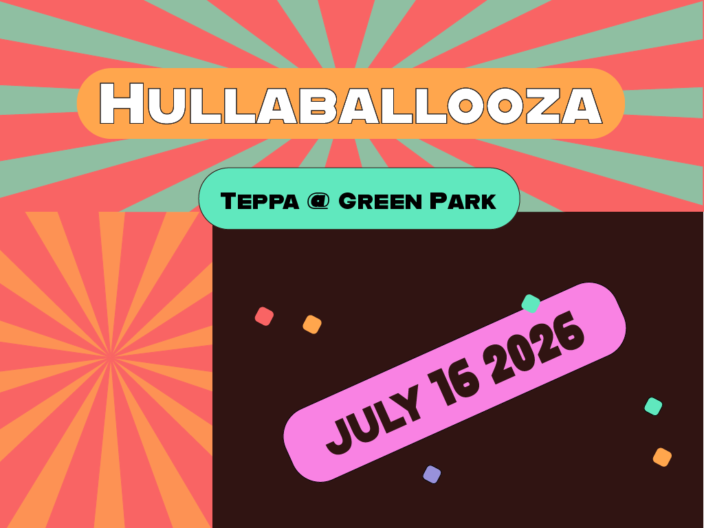
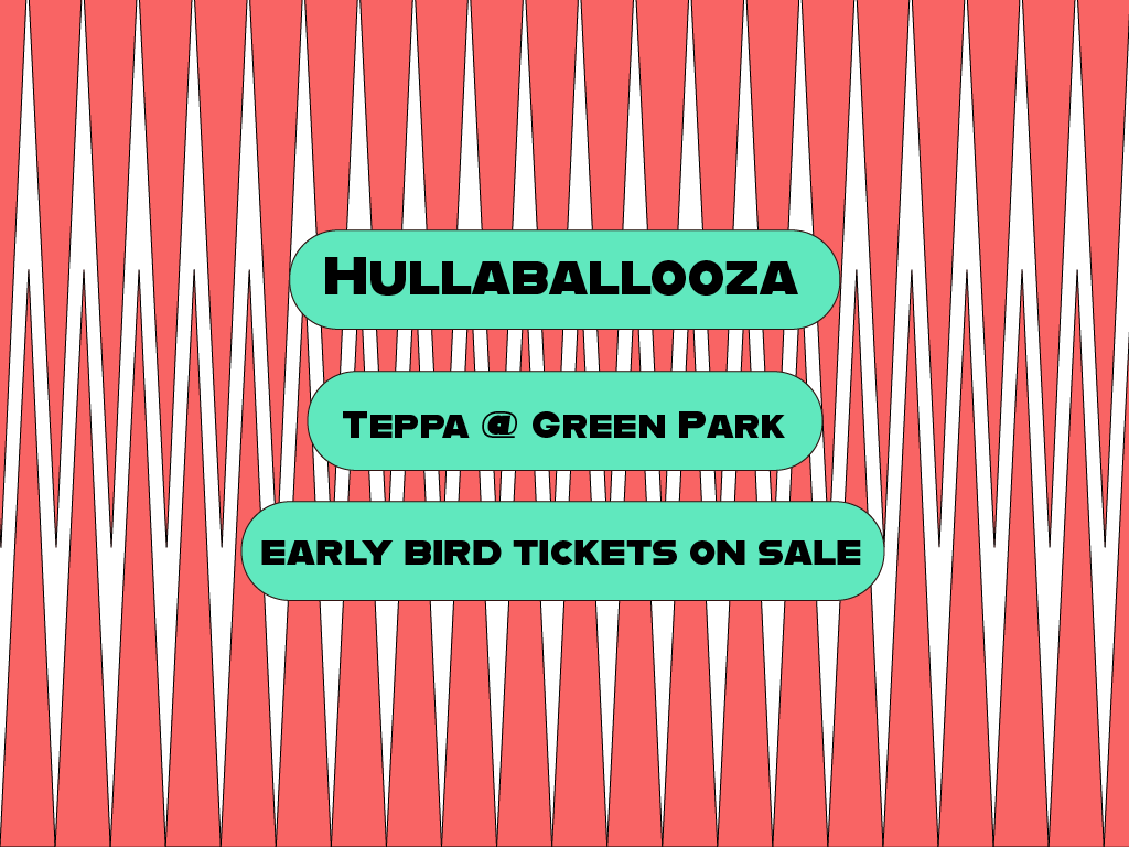
Socials Design
The chance to create repeatable patterns for the social posts that the event would require to advertise online was a chance to really explore complex compositions to see what would work without looking so visually busy it would distract from the necessary information.
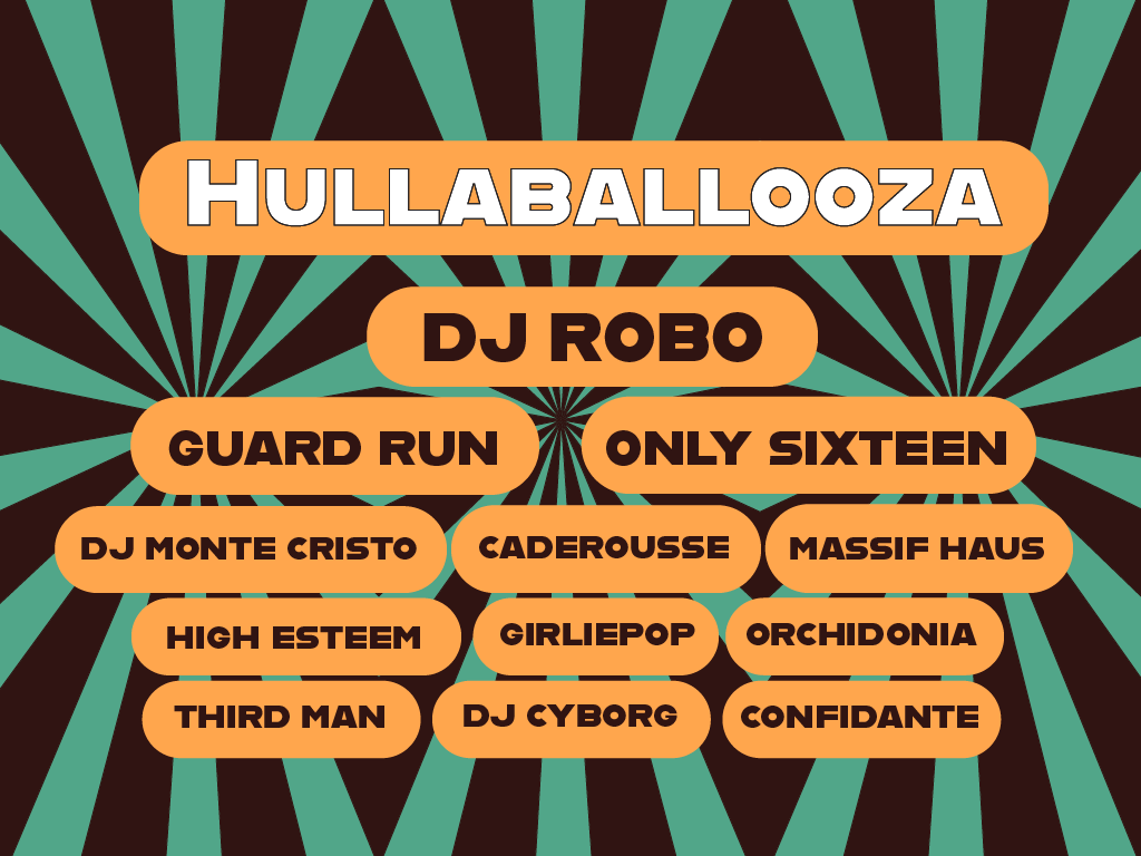
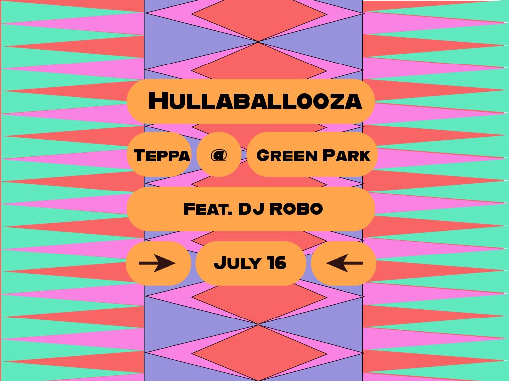
Email Marketing
Creating a consistent brand for the emails also meant that I could utilise the eye-catching patterns for email engagement. Generally, when people are waiting for updates from events they’ve signed up to, they will open and click through on emails at a far greater rate, but maintaining brand consistency is still key in keeping customers engaged and excited.

Get In Touch
If you're interested in working with me, complete the form with a few details about your project. I'll review your message and get back to you within 48 hours.